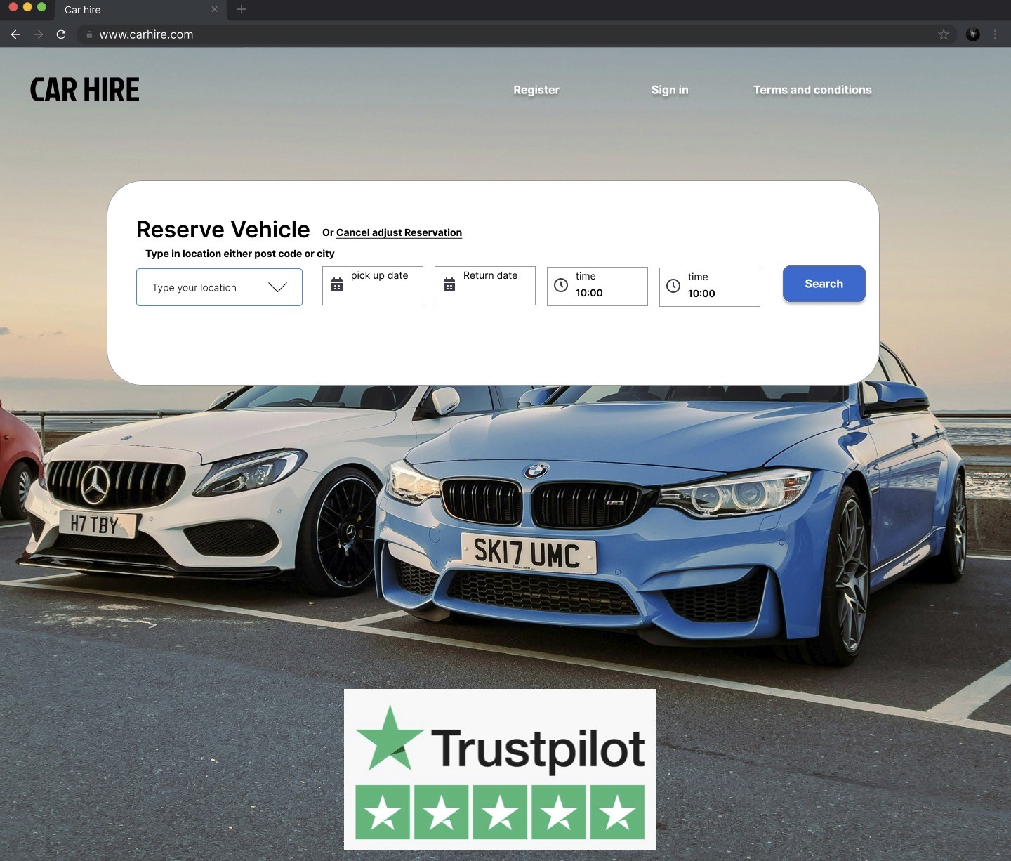
Car-Hire
Car-Hire is a UK-based service offering convenient car rentals through a shared car model, allowing customers to easily pick up and drop off vehicles for others to use.
Assignment
Febry 2024
UX designer
4 months
Challenge
As part of my project with the UX Design Institute, I explored Car-Hire's mission to promote sustainable urban living—aiming for a future where car-sharing outpaces car ownership in major cities worldwide.
Results
the redesign was a success, not only aligning with industry standards but also surpassing our competitors in key areas. We saw a significant increase in traffic to the add-on section, which directly contributed to higher revenue. Key improvements included clearer descriptions of add-ons, optimized performance on desktop, and an overall enhanced user experience. The project not only elevated the booking process but also set a new benchmark for intuitive and efficient car rental experiences
I conducted an in-depth usability test, guiding users through a series of tasks to uncover their goals, behaviors, and pain points. This approach allowed me to analyze user reactions to the booking process across multiple platforms. During the research, I discovered that the add-ons section across the website was a major source of dissatisfaction for many users. I also assessed their overall booking experiences to pinpoint opportunities for streamlining the process and enhancing usability.
Analysis
We reviewed all the research gathered and created an affinity diagram to organize key insights. This visual representation of our findings will guide our analysis and inform design decisions in the later stages of the UX process
Based on the user journey map, it was evident that there was a consistently negative perception around the add-ons section. Initially, I hadn’t planned to focus on this area, but insights from various research methods highlighted it as a key issue worth addressing
The Goal
The flow & Sketching the user journey
I built upon the customer journey map from the previous project to tackle the core problem, using it as a foundation to design a high-level booking flow that aligns with the 'ideal' or 'happy' path for the website, while meticulously sketching out the booking process and add-on screens to create an intuitive, seamless, and user-centered experience; this approach, guided by the journey map, allowed me to identify critical pain points, refine the flow with purpose, and ensure every interaction met user needs and expectations.
1 minute video of the first protoype
Your car rental prototype has a clear and linear flow, which is great for testing the high-level interactions, layout, and overall user experience. The call-to-action buttons are well-designed and effectively guide users through the booking process. I also appreciate the inclusion of the auto-fill feature—it’s a nice touch that enhances usability. over all there were to many steps for the user and the add on section was quite clunky. Additionally, the calendar functionality needs attention. While you can navigate between months, the dates don’t update according to the selected month, which can be confusing. Improving this interaction will make the calendar more intuitive.


