

IMPACT
Reducing onboarding friction and improving progression
The redesigned flow improved onboarding efficiency, reduced cognitive load, and helped users reach meaningful actions faster.

Issue 1
Far too much text to read, with too many options—making the interface feel cluttered and congested.
Issue 2
Users also struggled with the hierarchy and found the fields confusing to fill out.
Issue 3
A paywall appeared during onboarding that many users didn't feel they needed yet.
Understanding where users felt stuck
I then conducted several usability tests with participants who were unfamiliar with the website but had experience in the media industry.
Too much information created cognitive overload
Users felt overwhelmed by the amount of content and decisions during onboarding.
"There was a lot of information to go through."

Subscription logic created confusion
Users questioned why payment decisions appeared early in the setup process.
I don’t see the point of the subscription if my profile will change anyway

Lack of hierarchy reduced confidence
Too many competing interface elements made it difficult to know where to focus.
"There are a lot of boxes, and they all seem important"

Why This Matters
Confusing onboarding flows can reduce:
onboarding completion
user engagement
time-to-value
activation rates
For creative platforms like Tabb, users need to quickly:
upload work
connect with collaborators
start engaging with the platform
create profiles
Design goals
What I aimed to achieve
Simplify decisions
Turn scattered options into a clear direction, so users don't have to think.
Build visual trust
Design a flow that gives users confidence while they build their profile.
Drive adoption
Make users feel fully in control, with profiles that feel unique to them.
Process
From 9 steps to 5
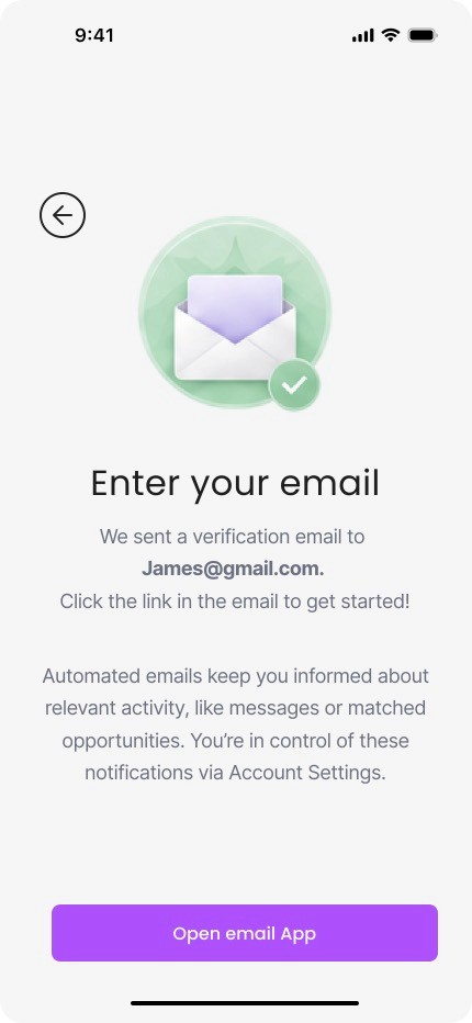
The original flow made users answer questions that belonged later in the journey. The redesign removed premature decisions and deferred non-critical setup to post-activation.
The difference in onboarding flows. A linear look


Behind Design Decisions
Please Click through Tabbed sections


TESTING
Testing whether the new flow reduced friction
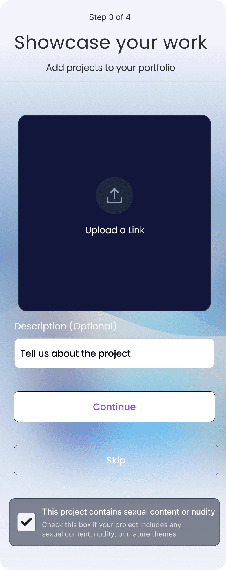
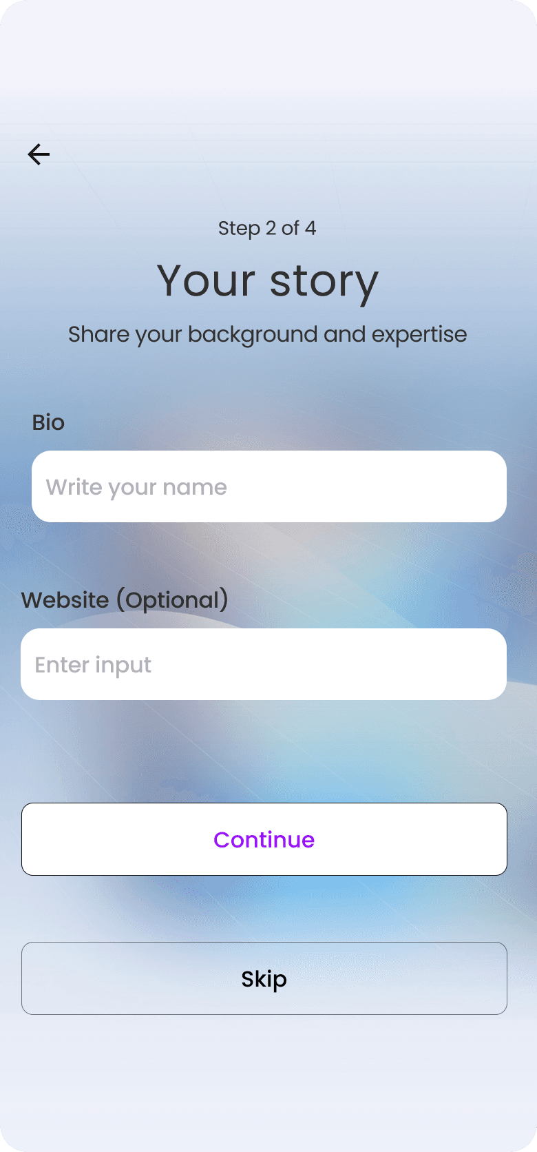
We validated the redesign through usability testing focused on onboarding clarity, navigation flow, and task completion efficiency. The first design reflects the initial version we launched, while the second shows the refined experience shaped by user feedback and testing insights.



Lessons
What I learned

TEAM


2
Time
2025
My role
UX Designer
KEY SKILLS
Research
UX
UI