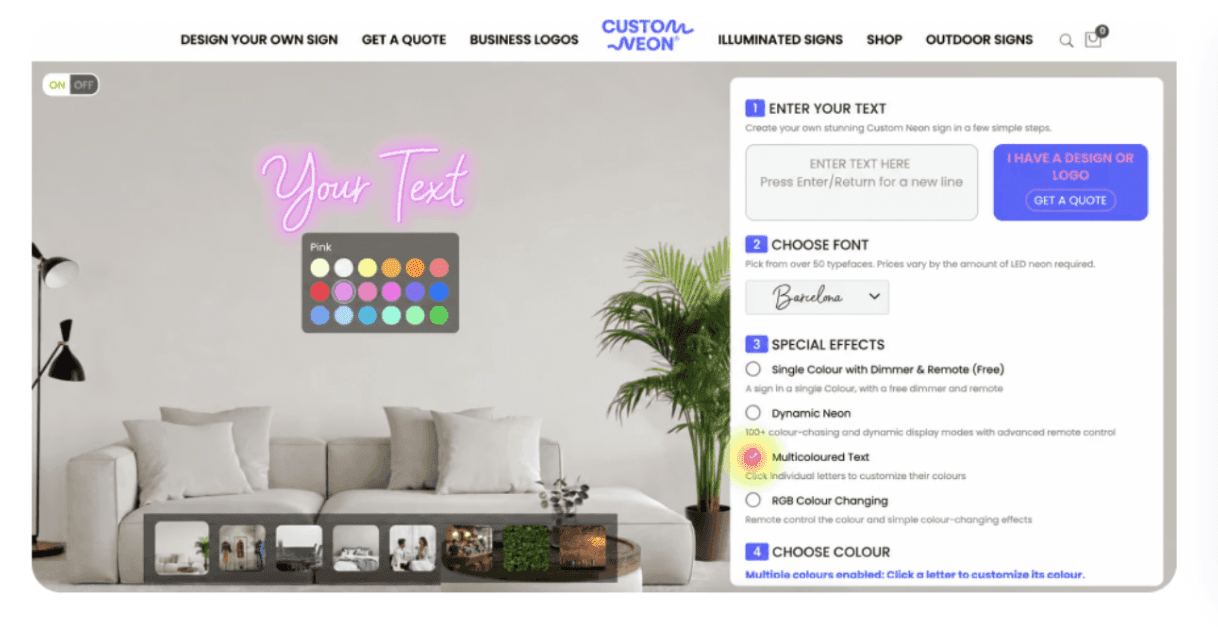
Multi-colour neon, without emailing the design team

Designing signage and presentations for clients worldwide.

Multi-colour neon, without emailing the design team

Designing signage and presentations for clients worldwide.

Multi-colour neon, without emailing the design team

Designing signage and presentations for clients worldwide.

TEAM

3

Time

2024

My role

Graphic designer / ux designer

KEY SKILLS

UX/UI design

journey mapping

visual design

TEAM

3

Time

2024

My role

Graphic designer / ux designer

KEY SKILLS

UX/UI design

journey mapping

TEAM

3

Time

2024

My role

Graphic designer / ux designer

KEY SKILLS

UX/UI design

journey mapping

visual design

INTRO

The builder is the shop

The builder is the shop

The builder is the shop

Customneon sells made-to-order LED neon signs online. Nearly every order is configured in one screen: type your text, choose a font, a colour and a size, and the builder renders a preview and a price. It exposed exactly one colour per sign while the factory had been making two- and three-colour signs by hand for years.

The problem

Customers couldn't tell multi-colour was possible, so they compromised or bought elsewhere.

The option wasn't in the product

Multi-colour existed as something the design team could do, not as something the builder offered. There was no control to find.

Audit of the live builder and the ordering journey end to end — no entry point for a second colour at any step.

A green and white snowflake on a black background
The design team absorbed it by hand

Every multi-colour sign started as an email. Someone read the request, mocked it up, sent a proof back, and waited for a reply before the order could exist.

Three months of design-team request threads, read and tallied by request type — per-word colour was the most common ask.

red and white Game On LED signage
The ones who didn't email just left

A customer who assumed one colour was the limit had two options: order something plainer than they wanted, or buy from a builder that showed the choice.

Competitor audit — several UK builders surfaced per-word colour directly in the configurator, plus sales-call notes on lost quotes.

purple LED heart sign
IMPACT

What changed, and what I'd measure next

Custom Neon hasn’t shared post-launch revenue figures, so I won’t claim an impact I can’t prove. What I can show is a clear operational improvement: a process that once took three emails and two days now takes just four taps, removing a recurring request from the design team’s inbox.

The two metrics I set up with the team
  • Multi-colour attach rate — the share of signs ordered with more than one colour

  • Manual design tickets per week — the inbox this was meant to empty

Open

What I'd watch after that


  • Proof rework rate — does the preview still predict the parcel?

  • Drop-off at the colour step on mobile, where the tap targets are tightest

  • Average order value on multi-colour signs versus single

Open

The two metrics I set up with the team
  • Multi-colour attach rate — the share of signs ordered with more than one colour

  • Manual design tickets per week — the inbox this was meant to empty

Open

What I'd watch after that


  • Proof rework rate — does the preview still predict the parcel?

  • Drop-off at the colour step on mobile, where the tap targets are tightest

  • Average order value on multi-colour signs versus single

Open

Design Goal

Give people a choice they never knew they had

Keep the preview honest about the parcel.
A free choice is only free if price and proof move with it. Every colour offered had to be one the factory can make, priced correctly the moment it's chosen.

Open

Let anyone colour a sign word by word, themselves, without leaving the builder.
Someone who wants the first word pink and the rest white can build that sign, see what it costs and order it in one sitting — no email, no waiting, no asking whether it's even possible.

Open

Make the choice obvious, not merely available
An option you have to know about isn't an option. It had to be visible in the ordinary path through the builder, to a first-time customer who has never heard of the design team.

Open

The Solution

Making multi-colour designs self-serve

Applying different colours to individual words was one of the most common manual customer requests. I designed a per-word colour picker that updated the customer’s preview and design proof. Customers could create the effect themselves without leaving the ordering journey or waiting for the design team.

Tapping a word swaps its colour. The preview and the design proof update together.

A.

The word is the control


Each word is its own hit area with a selected state, so there's never a question of what you're about to change.

Open

B.

Swatches open in place

The tray appears next to the selected word and never covers the sign. Colours that can't be made at the chosen size are shown unavailable, not hidden.

Open

C.

Price and proof follow

Every change re-prices the sign and rewrites the design proof that gets emailed — one source of truth from preview to production.

Open

The process

Three ways to choose a colour, two of them wrong

Rejected

A separate colour panel

Colour lived in its own section below the text field — the first thing I built and tested.

Why it lost: people lost track of which word they were editing and had to look away from the sign to change it. Two places, one decision.

Open

Rejected

Preset two-colour palettes

Pick from a handful of curated combinations. Cheap to build, guaranteed manufacturable.

Why it lost: it answers a different question. The emails name specific words in specific colours — presets would have sent most of them back to the inbox.


Open

Passed

Colour on the sign itself

Tap a word in the preview, the swatch tray opens under it, the sign and the price change as you choose.

Why it won: fewest choices on screen, no context switch, and the thing you're deciding about is the thing you're touching.


Open

Rejected

A separate colour panel

Colour lived in its own section below the text field — the first thing I built and tested.

Why it lost: people lost track of which word they were editing and had to look away from the sign to change it. Two places, one decision.

Open

Rejected

Preset two-colour palettes

Pick from a handful of curated combinations. Cheap to build, guaranteed manufacturable.

Why it lost: it answers a different question. The emails name specific words in specific colours — presets would have sent most of them back to the inbox.


Open

Passed

Colour on the sign itself

Tap a word in the preview, the swatch tray opens under it, the sign and the price change as you choose.

Why it won: fewest choices on screen, no context switch, and the thing you're deciding about is the thing you're touching.


Open

From blank builder to paid order

Applying different colours to individual words was one of the most common manual customer requests. I designed a per-word colour picker that updated the customer’s preview and design proof. Customers could create the effect themselves without leaving the ordering journey or waiting for the design team.

What I've learnt so far

Rafiu Onalaja

Copy Email

Rafiu Onalaja

Copy Email

Rafiu Onalaja

Copy Email